RINSE E-COMMERCE MOBIL WEB
Project Summary
RINSE is an E-commerce responsive Mobil web designed to mainly customize your portable kit, especially for times of the COVID 19 pandemic. Kits for the care of your family and your home, offering a quick and easy solution at the time of purchase.
Time:13 days
Role: UX/UI designer
Tools: Miro + XD + Figma + Overflow + Sketch + Keynote
Framework
We followed a framework composed of six phases formulated on different design methodologies such as Design Thinking (IBM), Lean UX, Hyper Island Ideation, and Agile.
Competitive Audit
UX audit helped us to understand what E-commerce is doing with respect to the market and what users are looking for at the moment of a digital transaction.
We audited more than 20 companies that work with natural ingredients and/or by subscription, environmentally friendly, like Public Goods, Fourth Ray, Lush and Moon Juice.
SURVEY
The survey helped us to understand our consumers and how our product is going to meet their needs like; expectations, concerns, and feedback.
In less than 48 hours we received 144 responses.
86% of the people prefer a customizable Covid-19 kit.
75.7% of the people prefer reusable and washable face masks.
The 4 most important considerations made at the time of purchase:
1:1 interview
The 1:1 interview is the best way to obtain qualitative data about our product.
Melissa Cardona|Mother of two|37 years old
“ For me, the most important thing is to have the kids safe. they’re getting used to the mask. But with the morning madness, we need the same place to keep everything we need for protection; The mask, the sanitizer, wipes.”
“I like well sourced products and washable products”
Austin Greenberg |Student| 23 years old
“ I am inmune compromised, Covid-19 is top subject. Top safety. I would like to shop in one place everything I need”
Define
Persona
After we learned about our consumer needs, we created a fictitious identity that reflects one of the user groups to whom we are designing.
Portable customizable kit for covid 19 and the care of your family.
3 clicks to Customize your kit.
A faster way at the time of purchase.
An organic and substantial source of ingredients.
Beautiful and simple.
Ideate
Sitemap
Design
Design is one of my favorite parts besides the learning face. We made sketches by hand to save time, and time saves money ;). sketching is an easy way to generate as many ideas as possible in a faster way. I draw a lot of basic sketches to consider the problem from different angles and to consider different solutions.
Wireframes
More than 64 wireframes were created over 7 versions, experimenting and itinerating with our consumers, observing in detail all their behavior with the Mobil web; their questions, and their interactions with our digital product.
Version 1
I created the landing page as an introduction to all products that involve the brand. Taking into account all information from our surveys.
Version 2
After the iteration and the feedback received from the user, I simplify how to create a bag of goods and the information about the product.
Version 3
In this version, I advanced with shopping cart creation and I removed a lot of useless information that our user suggested.
Version 4
I designed a faster way of shopping and adding products to the shopping cart.
Version 6
Here, I created a final purchase receipt that shows a summary of all goods and payment info.
Version 5
And finally, I change the product visualization for a more user-friendly wireframe to be tested.
User Flows
We digitized our sketches which became our blueprint of each page, working and iterating on the layout, features and elements.
Mood board
The goal for RINSE was to provide users with clean and inviting aesthetic. Utilizing a soft palette to evoke cleanliness and comfort when navigating through our site.
Style Guide
Experiment
To ensure that the user flow down the sales funnel was seamless, we needed to solidify and gather measurable results through user testing. We created a plan of action that entailed a series of tasks to understand how our users would navigate through the flow. We also observed and listened to expressions and reactions of our layout design to ensure that it was intuitive and user friendly
Iterate
customize your Kit
This interaction shows how the user would select their kit size, complimentary pouch and what it would look like if the user selected an item during this process. When an item is selected it will darken, indicating a selected state.
Check-out products
Following Luke W’s best practices, it was important to make sure there was proper spacing and left alignment on all field labels. Added a breadcrumb nav at the top of each page to provide the user step by step guide to reducing any confusion during the checkout process.
Launch
Final Mockup Homepage Versions
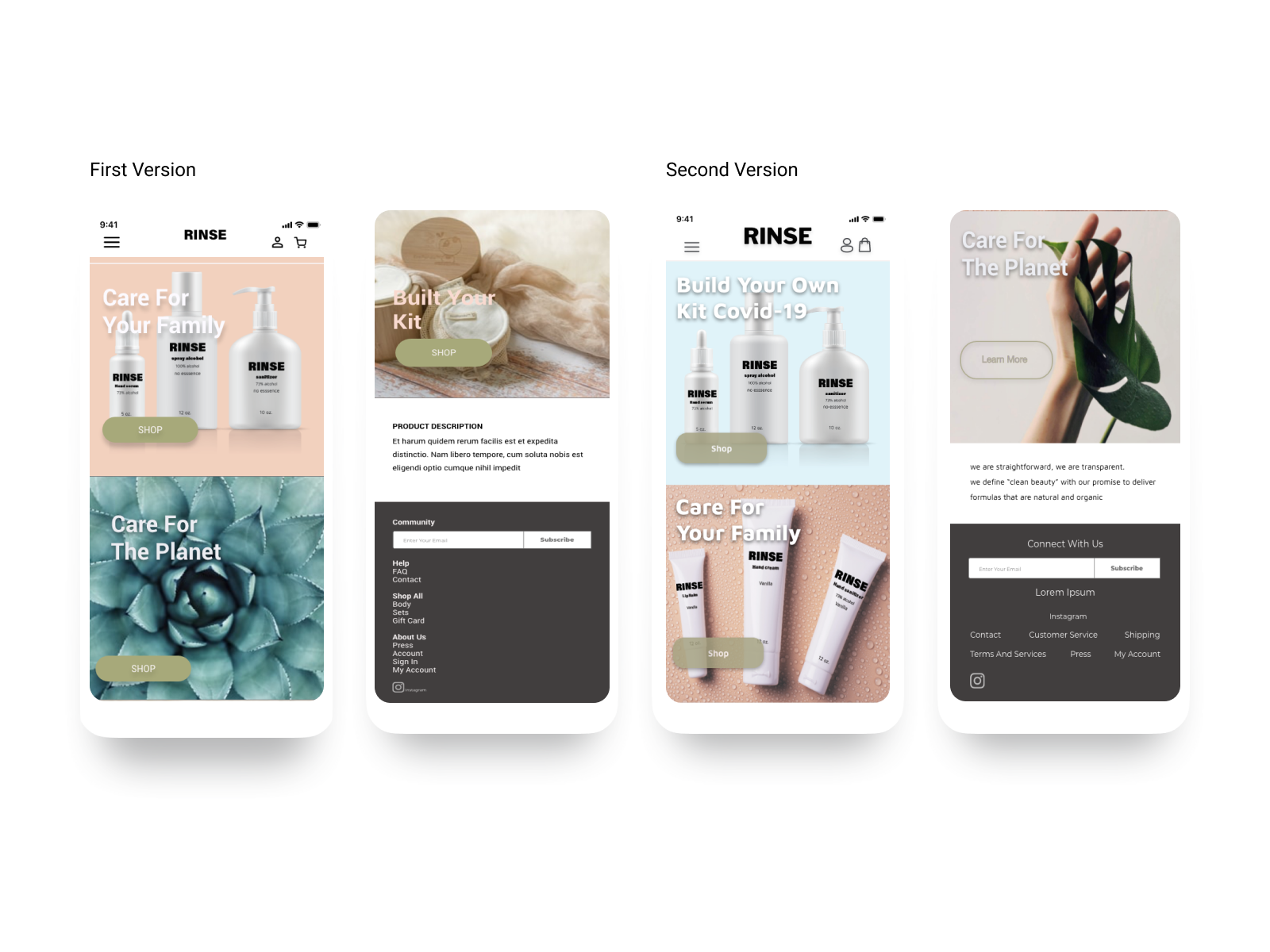
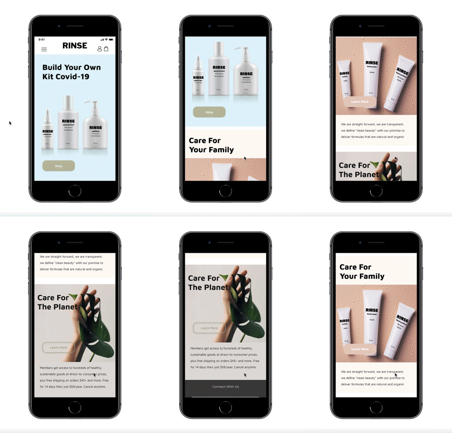
and this would be the final home page after experimenting and iterating.


