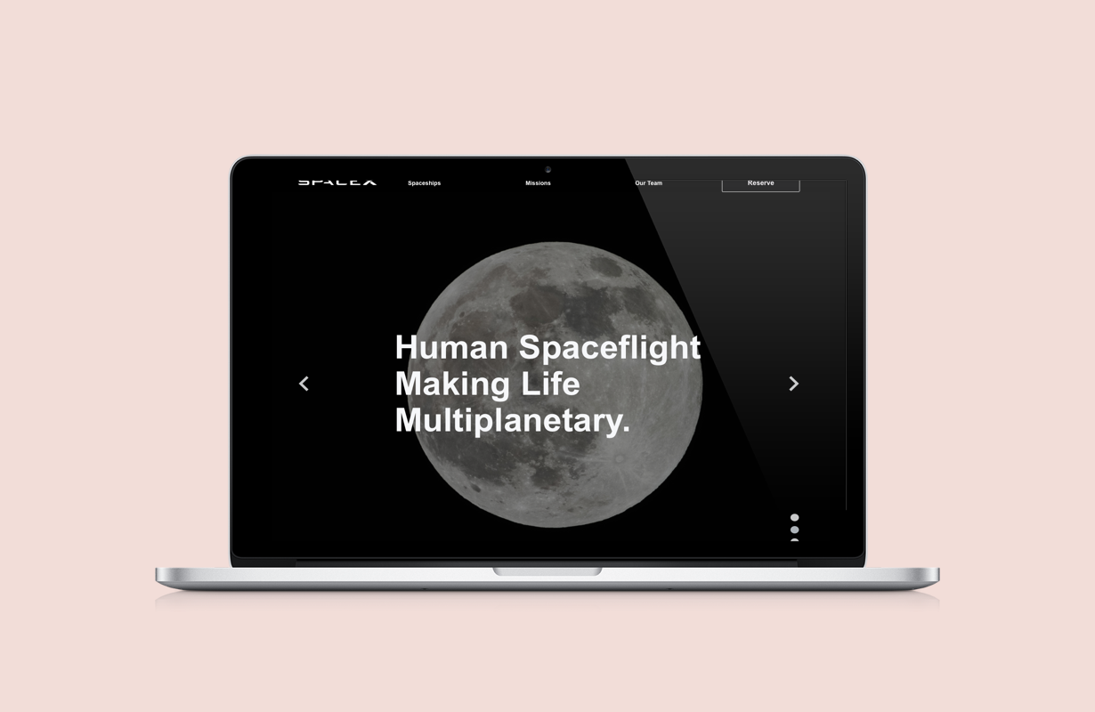
Space X Redesign
An American aerospace manufacturer and space transportation services company. Their goal is to reduce space transportation costs to make affordable spaceflight a reality and to enable the colonization of Mars with rapidly reusable rockets.
My Role: Independent UX/UI Designer
Project Timeline: 2 Weeks
Tools: Sketch, Google Suite, Cloud App, Miro, InVision
Summary of the Project: SpaceX has introduced the concept of future space travel becoming reality but does not include enough content to draw engagement to their website. My goal was to improve the overall layout and include an interactive quiz to enhance user experience.
Learn Phase
I start by understanding the users and SpaceX needs. I find inspiration for different tasks and conduct desk research by searching, absorbing and listening to what the world is saying. This involves social listening, finding web data and auditing other sites for good and bad examples in order to begin identifying problems.
Define
I began to identify goals, objectives, and strategies before I could start designing. In the define phase, I understood more about who the product users are and how they can better navigate through the website.
Task Flows
High fidelity flow chart Because the booking process for space travel is not realistic for many, it was key to identify the steps and useful information that is required for travel in order to understand how I could engage users in other ways to engage with SpaceX.
A click-by-click process of interacting with features on the website. It is the series of steps that a user takes in order to complete a task. I’m able to understand possible user pain points through the creation of a flow chart.
Information Architecture
A proposed page to page breakdown of the information architecture on a macro level.
Design
Sketches
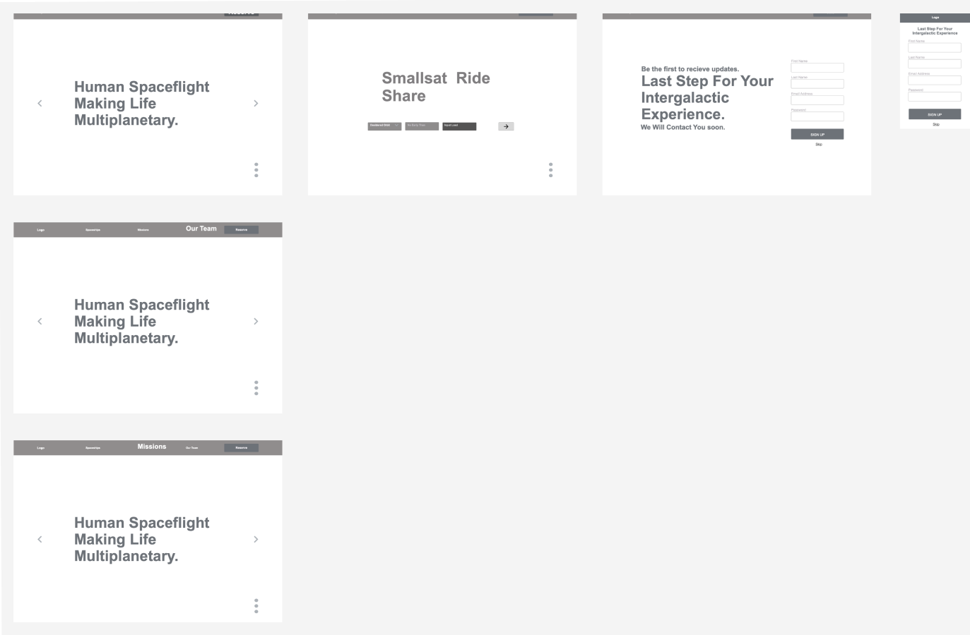
Wireframes
Creating a digitized design that derived from the best possible hand sketches. A lot of iterating took place in order to decide on the best system for users. A focal point was to design according to best practices that make it easy for the user to navigate and create elements that are familiar (back, x, next) & orientation (progress bar).
EXPERIMENT & ITERATE
Tested with users to gain feedback in order to improve upon design decisions.


